Joseph's Photojournalism Blog
Monday, September 30, 2013
Mergers
I chose this photo because the pointy building looks like it's coming out of a tree causing the two to look like they're merging.
Balance
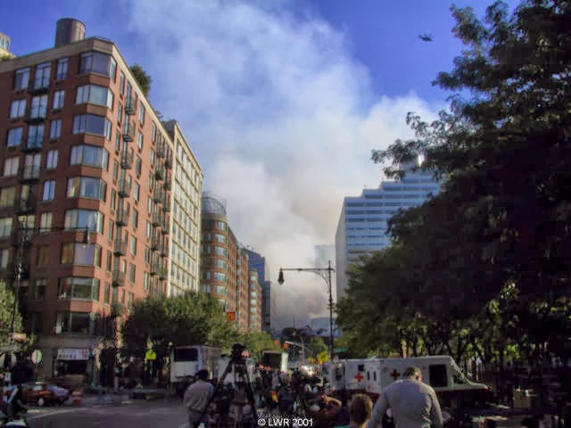
I chose this photo because one half is dark and one half is lighter. And also there are buildings on both sides of the streets.
Lines
I chose this pictures the lines behind the falling man show more dynamic contrast and line up with him.
Thursday, September 26, 2013
Rule of Thirds
I chose this photo because it's dark in mainly all areas except in the top left where the American flag is and it makes it pop out more.
Framing
I chose this photo because the faces of the fallen people are surrounding the the man.
Simplicity
I chose this photo because it's a perfect view of the Twin Towers. There is a plain background which is making the towers stand out.
Masters of Black and White Photography
Tina Modotti
Emmet Gowin
Clarence John Laughlin
Tuesday, September 24, 2013
First photos, best & worst
Best photo!
I chose this photo as the best because I like the outdoors and I enjoy nature.
Worst photo!
I think this one is the worst because it's kind of plain and the surroundings aren't so good.
Welcome to my blog
Newer Posts
Home
Subscribe to:
Posts (Atom)